
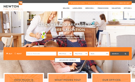
This website for Newton Fallowell estate agents utilises a bold but simple colour scheme throughout. The colours are drawn from Newton Fallowell's logo, which creates a consistency of branding, and the website uses the bright orange to draw the attention of users to important information and CTA features. Upon accessing the website, a visitor is immediately presented with a property search function in the middle of the page. For those visiting the website specifically to look for a propety, this makes it quick and easy for them to access the feature without any hassle. For those visiting the website for other purposes, the presence of this search bar may be enough to attract their curiosity to look for potential properties - something which they may not have considered otherwise. Also featured on the homepage are a selection of properties which have recently been listed with Newton Fallowell, including a photo and some information about them. These could get users attention, drawing their interest to a particular property, and making them more likely to look around the website at other properties. The website is easy to navigate, meaning visitors can quickly locate the page or information they are looking for - the menu bar remains at the top of the screen as users scroll down the page, this presence allows users to move around the website without having to scroll to the top of the page. Another feature which will appeal to site users is the possibility to create an account on the website, this provides various features including the ability to save properties to consider and review later.