
Categories
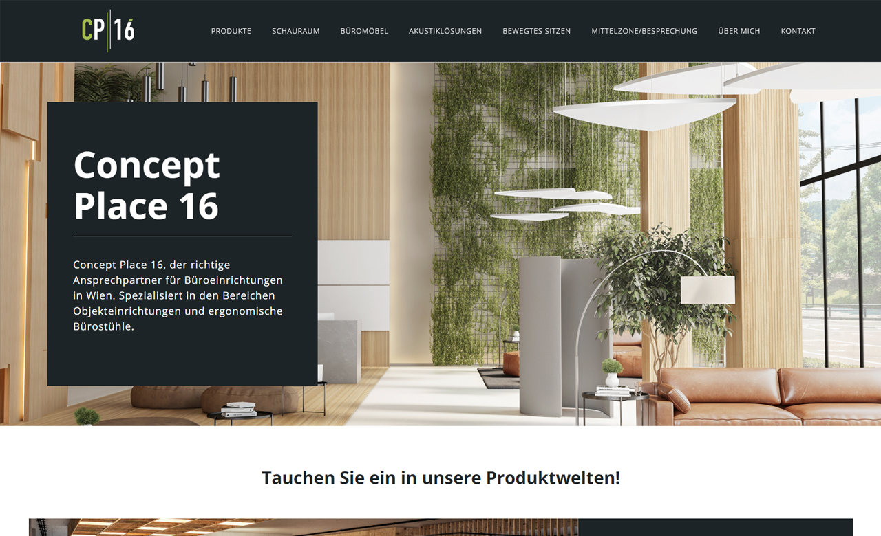
A website relaunch was carried out for the customer Concept Place 16 in order to present the website in a contemporary, fresh design and to make it more appealing and intuitive for visitors based on current usability standards. Furthermore, an integration to the online research platform "architonic" was created, which implemented an interactive interface to a digital product catalog. This makes it very easy for users to browse office products from different manufacturers, to create watch lists and thus to express specific requirements and wishes even before the offer is made by CP16. The visual concept for the page focuses on simple operation and a clear design language. Due to the stronger focus on anthracite as the primary color paired with dynamic, light green accents as the secondary color, the corporate identity has now been displayed in a significantly higher quality and at the same time more subtle. In addition to the reduced, minimalist design language, simple pictograms ensure easy comprehensibility. The existing image world is rounded off by high-quality and stylistically similar manufacturer images and is intended to provide a good insight into natural office space.